import matplotlib.pyplot as plt
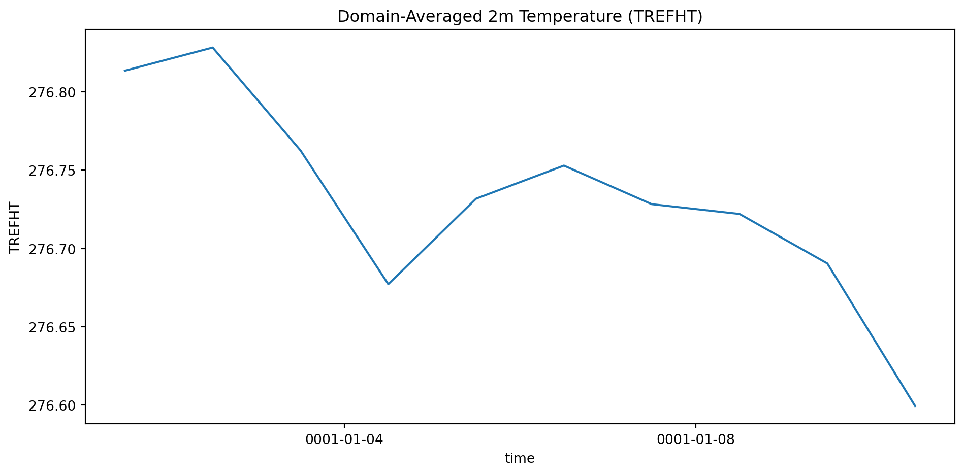
naive_mean = ds['TREFHT'].mean(dim=['latitude', 'longitude'])
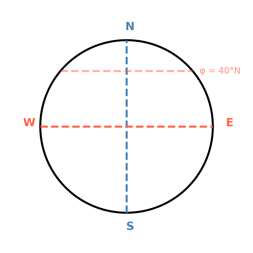
weights = np.cos(np.deg2rad(ds.latitude))
weights.name = 'weights'
weighted_mean = ds['TREFHT'].weighted(weights).mean(dim=['latitude', 'longitude'])
bias = float((naive_mean - weighted_mean).mean())
fig, axes = plt.subplots(1, 2, figsize=(10, 4))
# Left: weight profile
lats = ds.latitude.values
w1d = np.cos(np.deg2rad(lats))
axes[0].fill_betweenx(lats, 0, w1d, color='steelblue', alpha=0.7)
axes[0].set_xlabel('cos(lat) weight', fontsize=11)
axes[0].set_ylabel('Latitude (°N)', fontsize=11)
axes[0].set_title('Grid Cell Area Weights', fontsize=12, fontweight='bold')
axes[0].annotate('Tropics:\nfull weight', xy=(0.98, 2), xytext=(0.55, -40),
fontsize=9, color='steelblue',
arrowprops=dict(arrowstyle='->', color='steelblue', lw=1.5))
axes[0].annotate('Poles:\nnear zero', xy=(0.08, 88), xytext=(0.35, 60),
fontsize=9, color='gray',
arrowprops=dict(arrowstyle='->', color='gray', lw=1.5))
# Right: comparison with annotated gap
t = np.arange(len(naive_mean))
nv = naive_mean.values
wv = weighted_mean.values
axes[1].plot(t, nv, color='tomato', linewidth=2.5, label='Naive mean')
axes[1].plot(t, wv, color='steelblue', linewidth=2.5, label='Area-weighted')
axes[1].fill_between(t, nv, wv, alpha=0.15, color='purple')
mid = len(t) // 2
axes[1].annotate('', xy=(mid, wv[mid]), xytext=(mid, nv[mid]),
arrowprops=dict(arrowstyle='<->', color='black', lw=2.0))
axes[1].text(mid + 0.3, (wv[mid] + nv[mid]) / 2,
f'{abs(bias):.1f} K error!', fontsize=12, color='darkred', fontweight='bold')
axes[1].set_title('Global Mean TREFHT', fontsize=12, fontweight='bold')
axes[1].set_xlabel('Time step', fontsize=11)
axes[1].set_ylabel('K', fontsize=11)
axes[1].legend(fontsize=10)
plt.suptitle('Naive mean is wrong by nearly 9 K — xarray fixes it in one line',
fontsize=11, fontweight='bold', color='darkred', y=1.01)
plt.tight_layout()
plt.show()