Mon    15.2
Tue    18.7
Wed    22.1
Thu    19.8
dtype: float64ATOC 4815/5815
Tabular Data & Pandas Foundations - Week 4
2026-01-01
Rolling Windows
Rolling window: Compute statistics over a moving time window
Common uses:
- Smoothing noisy data
- Detecting trends
- Computing local statistics
import matplotlib.pyplot as plt

# Rolling means with different windows
df_temp['rolling_3h'] = df_temp['temp_c'].rolling('3h').mean()
df_temp['rolling_12h'] = df_temp['temp_c'].rolling('12h').mean()
df_temp['rolling_24h'] = df_temp['temp_c'].rolling('24h').mean()

# Plot
plt.figure(figsize=(9, 4))
plt.plot(df_temp.index, df_temp['temp_c'], alpha=0.3, label='Raw (hourly)')
plt.plot(df_temp.index, df_temp['rolling_3h'], label='3-hour rolling mean')
plt.plot(df_temp.index, df_temp['rolling_12h'], label='12-hour rolling mean')
plt.plot(df_temp.index, df_temp['rolling_24h'], label='24-hour rolling mean', linewidth=2)
plt.xlabel('Date')
plt.ylabel('Temperature (°C)')
plt.title('Temperature with Rolling Means')
plt.legend()
plt.grid(True, alpha=0.3)
plt.tight_layout()
plt.show()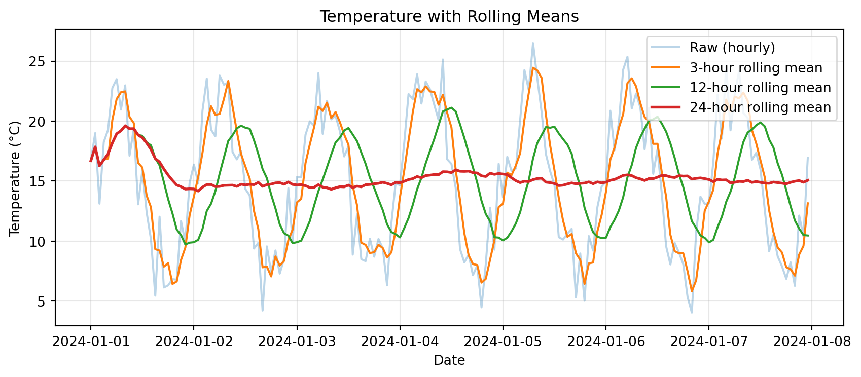
Cumulative Sums
Cumulative sum: Running total over time
Example: Total accumulated precipitation
# Create precipitation data
dates = pd.date_range('2024-01-01', periods=168, freq='h')
precip = pd.DataFrame({
    'precip_mm': np.random.exponential(0.3, 168)
}, index=dates)

precip['cumulative_precip'] = precip['precip_mm'].cumsum()

# Plot
fig, (ax1, ax2) = plt.subplots(2, 1, figsize=(9, 5), sharex=True)

ax1.bar(precip.index, precip['precip_mm'], width=0.04, alpha=0.6)
ax1.set_ylabel('Hourly Precip (mm)')
ax1.set_title('Hourly Precipitation')
ax1.grid(True, alpha=0.3)

ax2.plot(precip.index, precip['cumulative_precip'], linewidth=2, color='steelblue')
ax2.set_xlabel('Date')
ax2.set_ylabel('Cumulative Precip (mm)')
ax2.set_title('Cumulative Precipitation')
ax2.grid(True, alpha=0.3)

plt.tight_layout()
plt.show()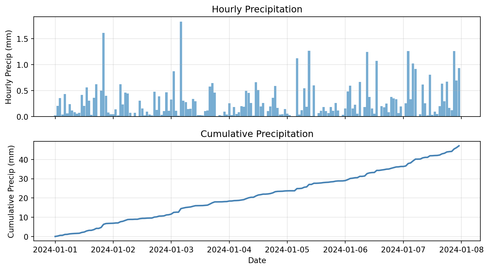
Pandas Native Plotting
For quick plots, Pandas supports native plotting functionality
DataFrame columns plot directly vs the DF index:
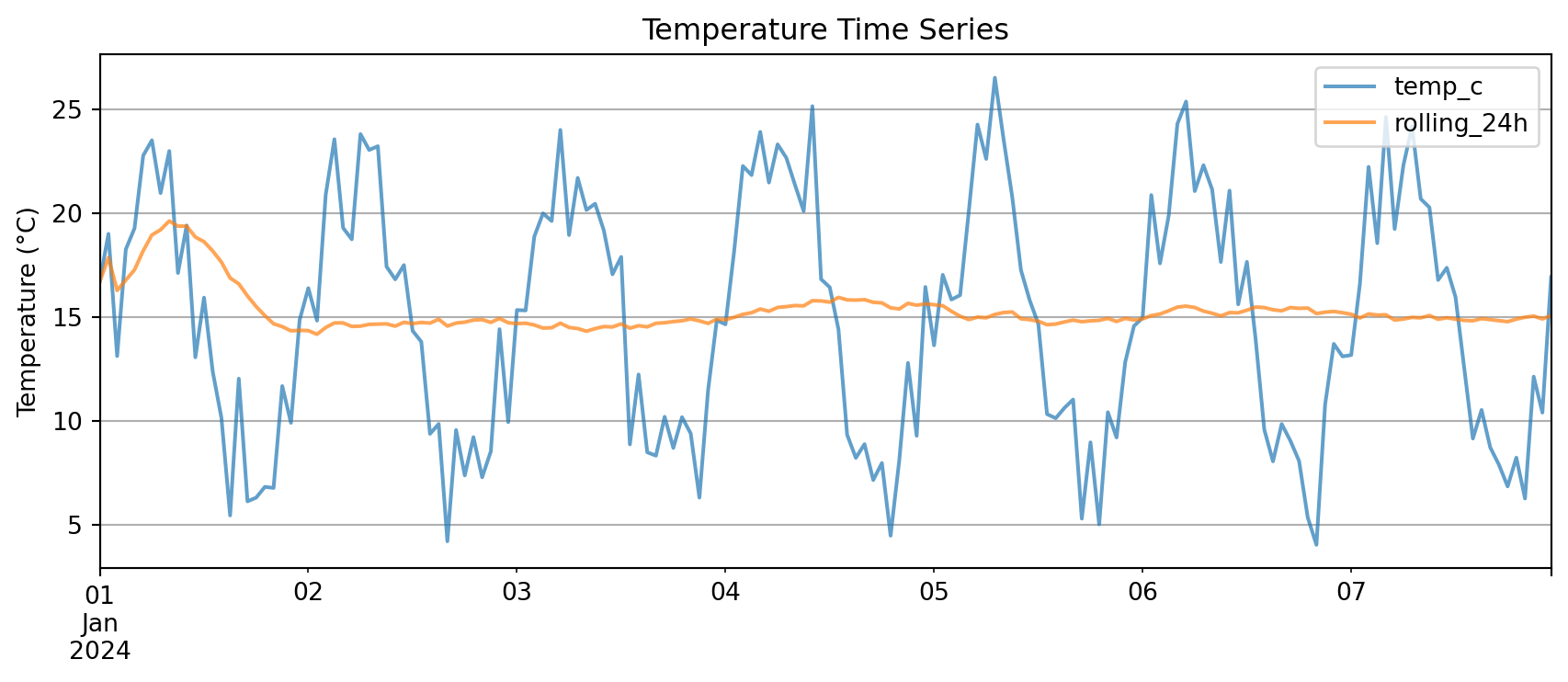
Key advantage: .plot() knows to use the index on the x-axis
You need very little matplotlib glue!
Multi-Panel Time Series
Complex example: Multiple variables with different scales
# Create comprehensive dataset
dates = pd.date_range('2024-01-01', periods=168, freq='h')
weather = pd.DataFrame({
    'temp_c': 15 + 8 * np.sin(np.arange(168) * 2 * np.pi / 24) + np.random.randn(168) * 2,
    'rh_pct': 60 + 20 * np.sin(np.arange(168) * 2 * np.pi / 24 + np.pi/4) + np.random.randn(168) * 5,
    'precip_mm': np.random.exponential(0.3, 168)
}, index=dates)

# Add derived quantities
weather['temp_rolling_24h'] = weather['temp_c'].rolling('24h').mean()
weather['cumulative_precip'] = weather['precip_mm'].cumsum()

# Create multi-panel plot
fig, (ax1, ax2, ax3) = plt.subplots(3, 1, figsize=(9, 7), sharex=True)

# Panel 1: Temperature
ax1.plot(weather.index, weather['temp_c'], alpha=0.4, label='Hourly Temp')
ax1.plot(weather.index, weather['temp_rolling_24h'], linewidth=2, label='24-h Rolling Mean')
ax1.set_ylabel('Temperature (°C)')
ax1.set_title('Weather Time Series Analysis')
ax1.legend(loc='best')
ax1.grid(True, alpha=0.3)

# Panel 2: Relative Humidity
ax2.plot(weather.index, weather['rh_pct'], color='green', alpha=0.7)
ax2.set_ylabel('Relative Humidity (%)')
ax2.grid(True, alpha=0.3)

# Panel 3: Precipitation
ax3.bar(weather.index, weather['precip_mm'], width=0.04, alpha=0.6, label='Hourly Precip')
ax3_cum = ax3.twinx()
ax3_cum.plot(weather.index, weather['cumulative_precip'], color='steelblue',
             linewidth=2, label='Cumulative')
ax3.set_xlabel('Date')
ax3.set_ylabel('Hourly Precip (mm)')
ax3_cum.set_ylabel('Cumulative (mm)')
ax3.legend(loc='upper left')
ax3_cum.legend(loc='upper right')
ax3.grid(True, alpha=0.3)

plt.tight_layout()
plt.show()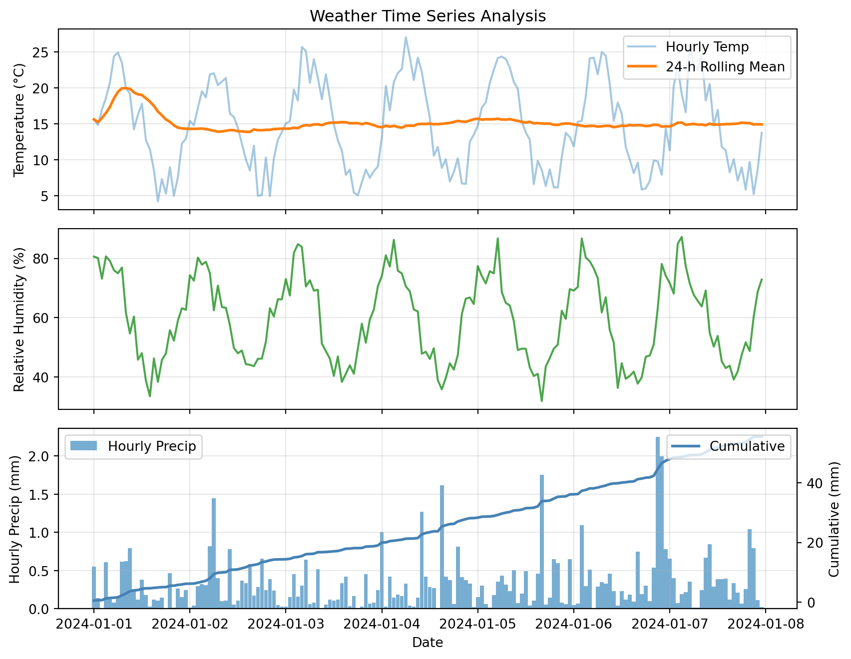
This plot combines:
- Raw and smoothed time series (top)
- Secondary variables (middle)
- Hourly bars + cumulative line with twin y-axes (bottom)