Why NumPy?
Big Idea: NumPy arrays let us do math on whole datasets at once , instead of writing slow Python loops.
Pure Python list:
= [15.2 , 18.7 , 22.1 , 19.8 ]= []for t in temps:* 9 / 5 + 32 )
Loop in Python
Manual append logic
Harder to read and optimize
NumPy array:
= np.array([15.2 , 18.7 , 22.1 , 19.8 ])= temps * 9 / 5 + 32
One line does the math for all elements
Operations implemented in fast C code
Reads like the mathematical formula
Arrays: fixed-size, typed, efficient blocks of numbers
NumPy lets you:
Apply operations to entire arrays (vectorize)
Avoid many explicit loops
Write shorter, clearer, and usually much faster numerical code
Common Error: Forgetting to Import
Predict the output:
= np.array([15.2 , 18.7 , 22.1 ])print (temps)
NameError: name 'np' is not definedThe Fix:
import numpy as np # ALWAYS at the top of your file = np.array([15.2 , 18.7 , 22.1 ])print (temps)
Takeaway: import numpy as np is the standard convention. Put all imports at the top of your script/notebook.
Creating Arrays
Big Idea: Use NumPy’s constructors to quickly build arrays for real data, ranges, and constant grids.
import numpy as np# From existing list = np.array([15.2 , 18.7 , 22.1 ])print (f"From list: { temps} " )# Range-like sequence = np.arange(0 , 10 , 2 )print (f"arange: { indices} " )# Evenly spaced samples = np.linspace(0 , 1 , 5 )print (f"linspace: { samples} " )
From list: [15.2 18.7 22.1]
arange: [0 2 4 6 8]
linspace: [0.   0.25 0.5  0.75 1.  ]
# Constant arrays = np.zeros(3 )print (f"zeros: { zeros} " )= np.ones(3 )print (f"ones: { ones} " )= np.full(3 , 20.5 )print (f"full: { filled} " )
zeros: [0. 0. 0.]
ones: [1. 1. 1.]
full: [20.5 20.5 20.5]
Takeaway:
np.array for real data you already havearange / linspace for ranges and sample points zeros / full for constant grids you will use in calculations
Check Your Understanding 🤔
What’s the difference between arange and linspace?
= np.arange(0 , 10 , 2 )= np.linspace(0 , 10 , 5 )
Answer:
arange(start, stop, step): goes from 0 to 10 by steps of 2 → [0, 2, 4, 6, 8]linspace(start, stop, num): 5 evenly spaced points from 0 to 10 → [0., 2.5, 5., 7.5, 10.]
Key difference: arange uses step size , linspace uses number of points and includes the endpoint!
When to use which?
arange: When you know the step (e.g., hourly data, every 5 km)linspace: When you need exact number of samples (e.g., 100 points for smooth plot)
Common Error: Integer Division
Predict the output:
= np.array([20 , 25 , 30 ]) # integers! = temps_c * 9 / 5 + 32 print (f"Result: { temps_f} " )print (f"dtype: { temps_f. dtype} " )
Result: [68. 77. 86.]
dtype: float64
Wait, this worked! Why?
In Python 3, / always returns float. But watch out for this:
= np.array([20 , 25 , 30 ])# Using integer division by mistake = temps_c // 5 # // is integer division! print (f"Wrong: { result} " )
Takeaway: Be mindful of your dtypes. When in doubt, create float arrays: np.array([20.0, 25.0, 30.0]) or temps_c.astype(float)
Array Attributes: dtype, shape, ndim
Big Idea: Check an array’s dtype, shape, and ndim early. It saves you from weird bugs later.
# 1-D array = np.array([15.2 , 18.7 , 22.1 ])print (f"dtype: { temps. dtype} " )print (f"shape: { temps. shape} " )print (f"ndim: { temps. ndim} " )
dtype: float64
shape: (3,)
ndim: 1
# 2-D array = np.array([[1 , 2 , 3 ], [4 , 5 , 6 ]])print (f"dtype: { data. dtype} " )print (f"shape: { data. shape} " )print (f"ndim: { data. ndim} " )
dtype: int64
shape: (2, 3)
ndim: 2
dtype – data type of the array
e.g. float64, int32, bool
Watch out if you accidentally create int when you want float
shape – size of the array in each dimension
1-D: (5,) (5 elements)
2-D: (2,3) (2 rows, 3 columns)
ndim – number of dimensions
1-D vector: ndim == 1
2-D matrix: ndim == 2
When something crashes or broadcasts strangely, first print:
array.dtype, array.shape, array.ndim
Visual: Understanding Shape
1-D array: shape = (5,)
────────────────────────────────────────
    [15.2, 18.7, 22.1, 19.8, 16.5]
      ↑     ↑     ↑     ↑     ↑
    idx 0   1     2     3     4


2-D array: shape = (3, 4) means 3 rows, 4 columns
────────────────────────────────────────
           Col 0  Col 1  Col 2  Col 3
    Row 0  [ 15     18     22     19  ]
    Row 1  [ 14     17     21     18  ]
    Row 2  [ 16     19     23     20  ]
           ↑
           First index = row
           Second index = column


Atmospheric example: 10 stations, 24 hours
────────────────────────────────────────
    shape = (10, 24)
            ↑    ↑
         stations hours
Key concepts:
1-D array: shape = (5,) → 5 elements in a line2-D array: shape = (3, 4) → 3 rows, 4 columnsThink: “rows first, then columns” (like matrix notation)Stations × Time: If you have 10 stations and 24 hours, shape is (10, 24)
Check Your Understanding 🤔
What will be the shape?
# 5 weather stations, 48 hours of data each = np.random.randn(5 , 48 )
Answer: shape = (5, 48)
First dimension: 5 stations
Second dimension: 48 hours
Total elements: 5 × 48 = 240
Now predict: What’s the shape of temps[0, :]?
(48,) — a 1-D array of 48 hours for station 0
Indexing and Slicing
Big Idea: NumPy indexing feels like list indexing, but works in multiple dimensions and stays fast.
1-D arrays:
= np.array([15.2 , 18.7 , 22.1 , 19.8 , 16.5 ])# Single element print (f"First: { temps[0 ]} " )print (f"Last: { temps[- 1 ]} " )# Slicing print (f"First 3: { temps[:3 ]} " )print (f"Last 2: { temps[- 2 :]} " )print (f"Every other: { temps[::2 ]} " )
First: 15.2
Last: 16.5
First 3: [15.2 18.7 22.1]
Last 2: [19.8 16.5]
Every other: [15.2 22.1 16.5]
N-D arrays:
= np.array([[1 , 2 , 3 ],4 , 5 , 6 ]])# Single element print (f"Row 0, Col 1: { data[0 , 1 ]} " )# Slicing print (f"First row: { data[0 , :]} " )print (f"Second column: \n { data[:, 1 ]} " )
Row 0, Col 1: 2
First row: [1 2 3]
Second column:
[2 5]
Key points:
1-D: temps[start:stop:step] just like lists
N-D: array[row_index, col_index] and array[row_slice, col_slice]
Slices are views into the original data (no copy in most cases)
Common Error: Wrong Dimension Indexing
Predict the output:
= np.array([[1 , 2 , 3 ],4 , 5 , 6 ]])print (data[1 ]) # What does this return? print (data[:, 1 ]) # What about this?
= np.array([[1 , 2 , 3 ], [4 , 5 , 6 ]])print (f"data[1]: { data[1 ]} " ) # Second ROW print (f"data[:, 1]: { data[:, 1 ]} " ) # Second COLUMN
data[1]: [4 5 6]
data[:, 1]: [2 5]
Common mistake: Forgetting that data[1] gives you a row , not a column!
To get a column, you need data[:, 1] (all rows, column 1)
Boolean Masks
Big Idea: Comparisons create boolean arrays that you can use to filter values. Masks replace manual if loops.
= np.array([15.2 , 18.7 , 22.1 , 19.8 , 16.5 ])# Create boolean mask = (temps >= 15 ) & (temps <= 22 )print (f"Mask: { mask} " )# Filter using mask = temps[mask]print (f"Comfortable temps: { comfortable_temps} " )
Mask: [ True  True False  True  True]
Comfortable temps: [15.2 18.7 19.8 16.5]
# Count how many meet condition = np.sum (mask)print (f"Number of comfortable temps: { count} " )
Number of comfortable temps: 4
Takeaway:
(temps >= 15) returns a boolean array& combines conditions elementwise (use &, not and!)temps[mask] selects only the elements where mask is TrueInstead of looping and if, build a mask once and index with it
Try It Yourself 💻
Challenge: Given this temperature data, find:
All temperatures above 20°C
How many hours were between 15-25°C
The indices where temp > 22°C (hint: np.where)
= np.array([...]) # 24 hours of data
Solution:
# 1. Temps above 20 = hourly_temps[hourly_temps > 20 ]print (f"Hot hours: { hot[:5 ]} ..." ) # show first 5 # 2. Count between 15-25 = np.sum ((hourly_temps >= 15 ) & (hourly_temps <= 25 ))print (f"Comfortable hours: { comfortable} " )# 3. Indices where > 22 = np.where(hourly_temps > 22 )[0 ]print (f"Hot hour indices: { indices} " )
Hot hours: [21.89329683 24.70023953 21.97111934 22.42714652 26.14676948]...
Comfortable hours: 15
Hot hour indices: [3 5 6 7 9]
Common Error: Using ‘and’ Instead of ‘&’
Predict the output:
= np.array([15.2 , 18.7 , 22.1 , 19.8 , 16.5 ])= (temps >= 15 ) and (temps <= 22 ) # Wrong!
ValueError: The truth value of an array with more than one element is ambiguous.The Fix:
= np.array([15.2 , 18.7 , 22.1 , 19.8 , 16.5 ])= (temps >= 15 ) & (temps <= 22 ) # Correct! print (f"Mask: { mask} " )
Mask: [ True True False True True]
Why?
and is for single boolean values: True and False& is for element-wise array operationsAlways use & (and | for OR) with NumPy arrays Don’t forget parentheses: (temps >= 15) & (temps <= 22)
Vectorized Operations & Broadcasting
Big Idea: NumPy applies the same formula to whole arrays at once. Scalars and smaller arrays are broadcast to match shapes.
= np.array([15.2 , 18.7 , 22.1 , 19.8 ])# Convert to Fahrenheit = temps * 9 / 5 + 32 print (f"°F: { temp_f} " )# Subtract baseline = 15 = temps - baselineprint (f"Anomaly: { anomaly} " )
°F: [59.36 65.66 71.78 67.64]
Anomaly: [0.2 3.7 7.1 4.8]
# Element-wise operations = temps ** 2 print (f"Squared: { temps_squared} " )# Works with functions too = np.round (temps, 1 )print (f"Rounded: { temps_rounded} " )
Squared: [231.04 349.69 488.41 392.04]
Rounded: [15.2 18.7 22.1 19.8]
Key concepts:
Arithmetic (+, -, *, /, **) is elementwise on arrays
Scalars are broadcast automatically to match array shape
You write the math once; NumPy handles the loops in fast C code
Think in formulas on arrays, not in explicit Python for loops
Common Error: Shape Mismatch
Predict the output:
= np.array([15 , 20 , 25 , 30 ]) # shape (4,) = np.array([5 , 10 , 15 ]) # shape (3,) = temps + wind
ValueError: operands could not be broadcast together with shapes (4,) (3,)Why? Arrays must have compatible shapes for broadcasting!
Debugging strategy:
= np.array([15 , 20 , 25 , 30 ])= np.array([5 , 10 , 15 ])print (f"temps.shape: { temps. shape} " )print (f"wind.shape: { wind. shape} " )# They must match or one must be 1!
temps.shape: (4,)
wind.shape: (3,)
The fix: Make sure your arrays have the same length, or reshape one of them
Array Statistics
Big Idea: NumPy has built-in “reductions” (mean, std, min, max, etc.) that keep your analysis code short and clear.
Full array:
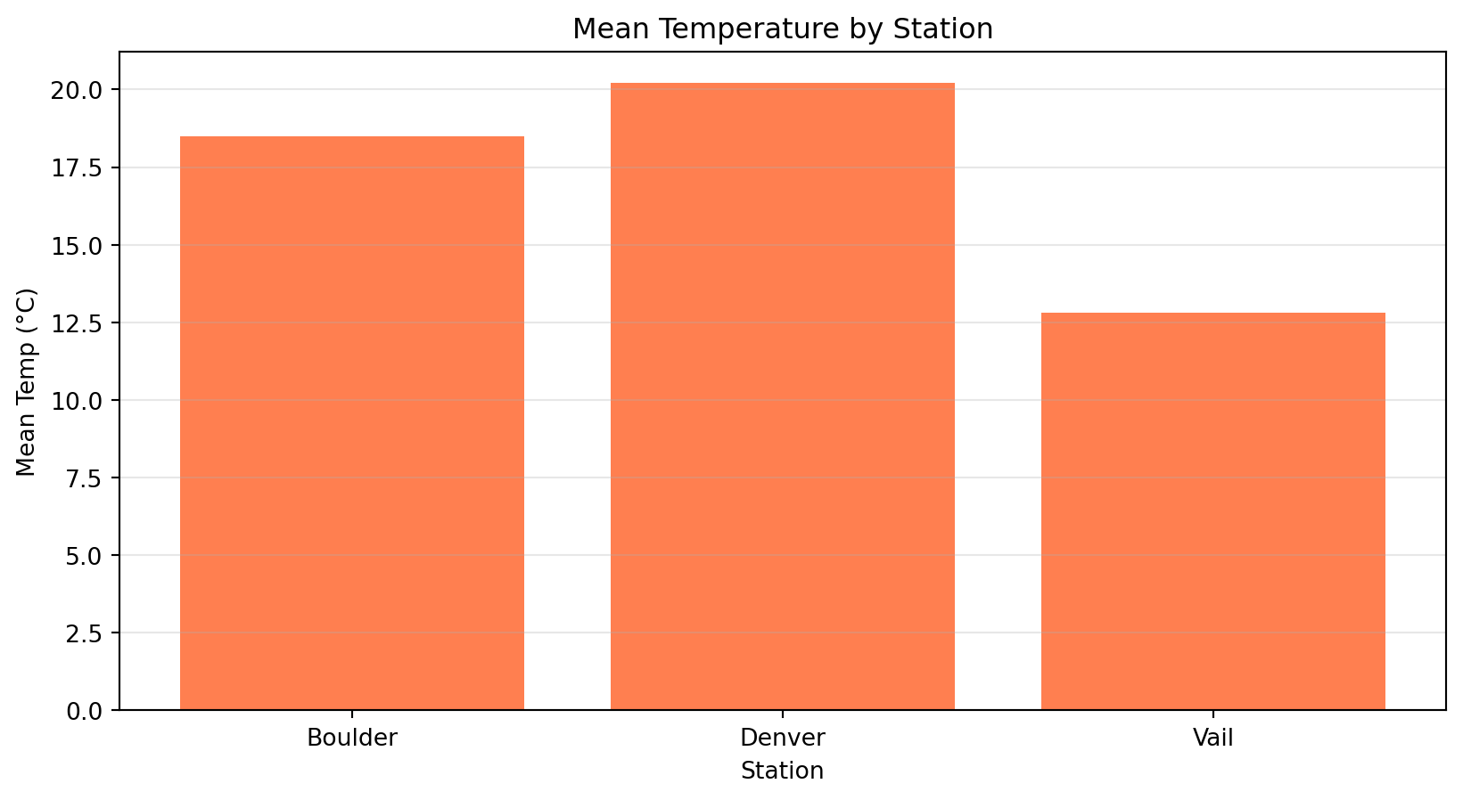
= np.array([15.2 , 18.7 , 22.1 , 19.8 , 16.5 ])print (f"Mean: { temps. mean():.1f} " )print (f"Std: { temps. std():.1f} " )print (f"Min: { temps. min ():.1f} " )print (f"Max: { temps. max ():.1f} " )print (f"Sum: { temps. sum ():.1f} " )
Mean: 18.5
Std: 2.4
Min: 15.2
Max: 22.1
Sum: 92.3
Axis example:
# 2D array: 3 stations, 4 times = np.array([[15 , 18 , 22 , 19 ],14 , 17 , 21 , 18 ],16 , 19 , 23 , 20 ]])# Mean across time (axis=1) = data.mean(axis= 1 )print (f"Station means: { station_means} " )# Mean across stations (axis=0) = data.mean(axis= 0 )print (f"Time means: { time_means} " )
Station means: [18.5 17.5 19.5]
Time means: [15. 18. 22. 19.]
Key points:
Reductions turn many values → one (or one per row/column)
axis=None (default) flattens everythingaxis=0 works “down” rows, axis=1 works “across” columnsUsing these methods avoids writing your own loops and counters
Visual: Understanding axis=0 vs axis=1
data = [[15, 18, 22, 19],     shape (3, 4)
        [14, 17, 21, 18],     3 stations (rows)
        [16, 19, 23, 20]]     4 times (columns)

axis=0: collapse ROWS (↓)     axis=1: collapse COLUMNS (→)
    ↓   ↓   ↓   ↓                 →  →  →  →
  [15, 18, 22, 19]              [18.5]  ← mean of row 0
                                [17.5]  ← mean of row 1
Result: (4,)                    [19.5]  ← mean of row 2
mean per TIME                   Result: (3,)
                                mean per STATION
Mnemonic: axis=0 → “collapse dimension 0 (rows)”
axis=1 → “collapse dimension 1 (columns)”
Check Your Understanding 🤔
Given this data:
# 4 stations, 24 hours = np.random.randn(4 , 24 ) * 5 + 20 print (f"Shape: { temps. shape} " )
What will be the shape of:
temps.mean(axis=0)temps.mean(axis=1)temps.mean()
Answers:
(24,) — mean across stations, one value per hour(4,) — mean across time, one value per stationScalar — mean of all values (flattened)
Common Error: Wrong Axis
Scenario: You want the mean temperature for each station (averaged over time)
# 4 stations, 24 hours of data = np.random.randn(4 , 24 ) * 5 + 20 # Which is correct? = temps.mean(axis= 0 )= temps.mean(axis= 1 )
Answer: temps.mean(axis=1)
= np.random.randn(4 , 24 ) * 5 + 20 = temps.mean(axis= 1 )print (f"Shape: { station_means. shape} " ) # (4,) ✓ print (f"Station means: { station_means} " )
Shape: (4,)
Station means: [19.55167332 21.05860409 20.14683389 21.58417493]
Why? axis=1 collapses the time dimension, leaving station dimension
Strategy: Always check the output shape! It should match what you expect.
Try It Yourself 💻
Challenge: Given temperature and wind speed data:
Calculate wind chill: WC = 13.12 + 0.6215*T - 11.37*V^0.16 + 0.3965*T*V^0.16 (T = temp in °C, V = wind speed in km/h)
Find how many hours have wind chill below 0°C
Calculate the mean and standard deviation of wind chill
Solution:
# 1. Calculate wind chill (vectorized!) = temps= wind_speed= 13.12 + 0.6215 * T - 11.37 * V** 0.16 + 0.3965 * T* V** 0.16 # 2. Count below 0 = np.sum (wind_chill < 0 )print (f"Hours with WC < 0°C: { below_zero} " )# 3. Statistics print (f"Mean WC: { wind_chill. mean():.1f} °C" )print (f"Std WC: { wind_chill. std():.1f} °C" )
Hours with WC < 0°C: 24
Mean WC: -6.9°C
Std WC: 3.8°C
Why Visualize?
Anscombe’s Quartet: Four datasets with identical statistics but very different patterns
# All four datasets have: = 9.0 = 7.5 = 0.816 Without plotting, they look the same!
With plotting:
Dataset 1: Linear relationship
Dataset 2: Quadratic curve
Dataset 3: Linear with outlier
Dataset 4: Vertical line with outlier
Always visualize your data!
Lesson: Statistics alone can mislead. Plots reveal the truth.
Common Error: Forgetting Import
Predict the output:
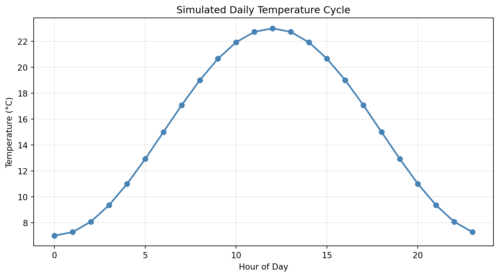
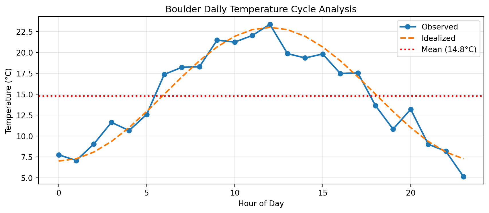
= np.arange(0 , 24 )= 15 + 8 * np.sin(hours * np.pi / 12 )
NameError: name 'plt' is not definedThe Fix:
import matplotlib.pyplot as plt # Standard convention import numpy as np= np.arange(0 , 24 )= 15 + 8 * np.sin(hours * np.pi / 12 )
Takeaway: Always import matplotlib.pyplot as plt at the top of your file
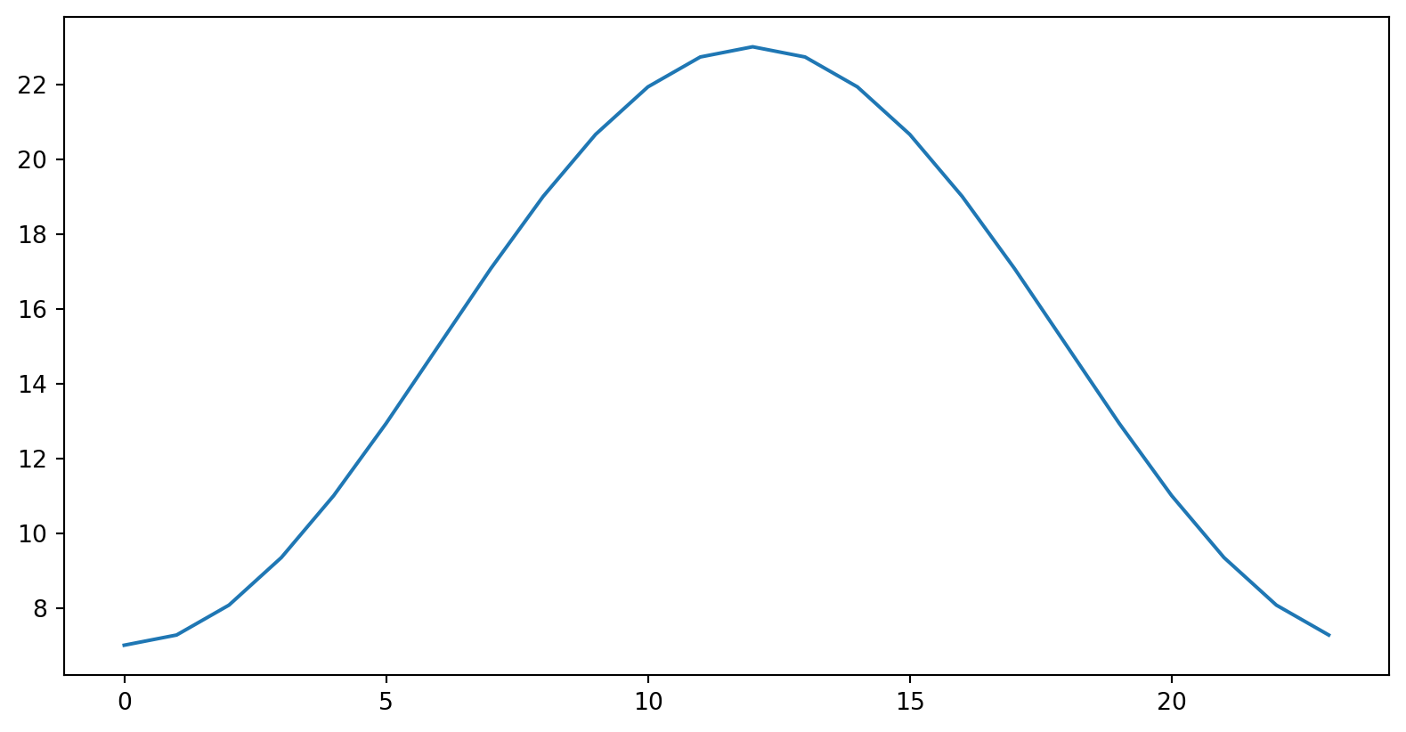
Common Error: Mismatched Array Lengths
Predict the output:
= np.arange(0 , 24 ) # 24 elements = np.array([15 , 18 , 22 ]) # 3 elements
ValueError: x and y must have same first dimension, but have shapes (24,) and (3,)Why? plt.plot(x, y) expects x and y to have the same length!
Debugging strategy:
print (f"hours.shape: { hours. shape} " )print (f"temps.shape: { temps. shape} " )# They must match! The fix: Make sure your x and y arrays have the same number of elements
Check Your Understanding 🤔
Which plot type would you use for:
Comparing average precipitation across 12 months?
Exploring relationship between humidity and temperature?
Showing temperature change over 24 hours?
Answers:
Bar plot — comparing categories (months)Scatter plot — relationship between two continuous variablesLine plot — showing change over time (continuous)
Key: Think about what question you’re answering!
Try It Yourself 💻
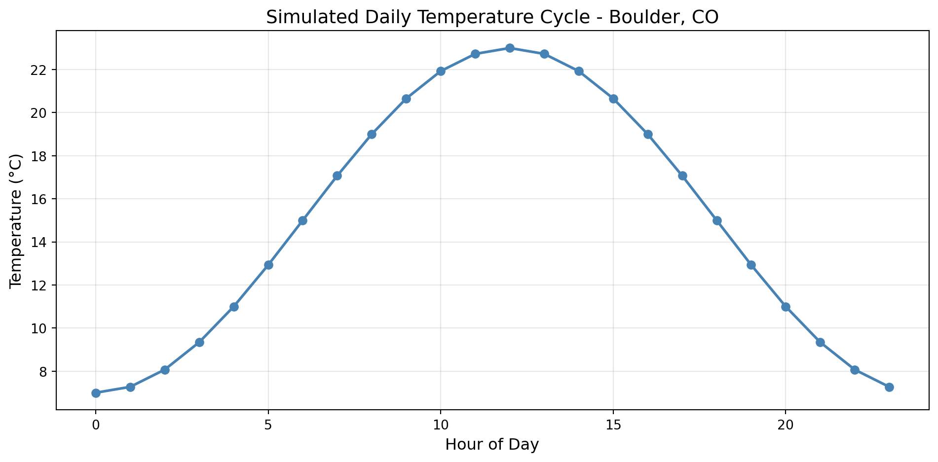
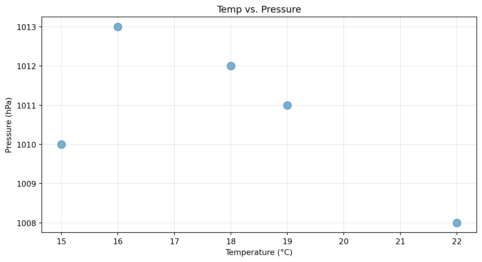
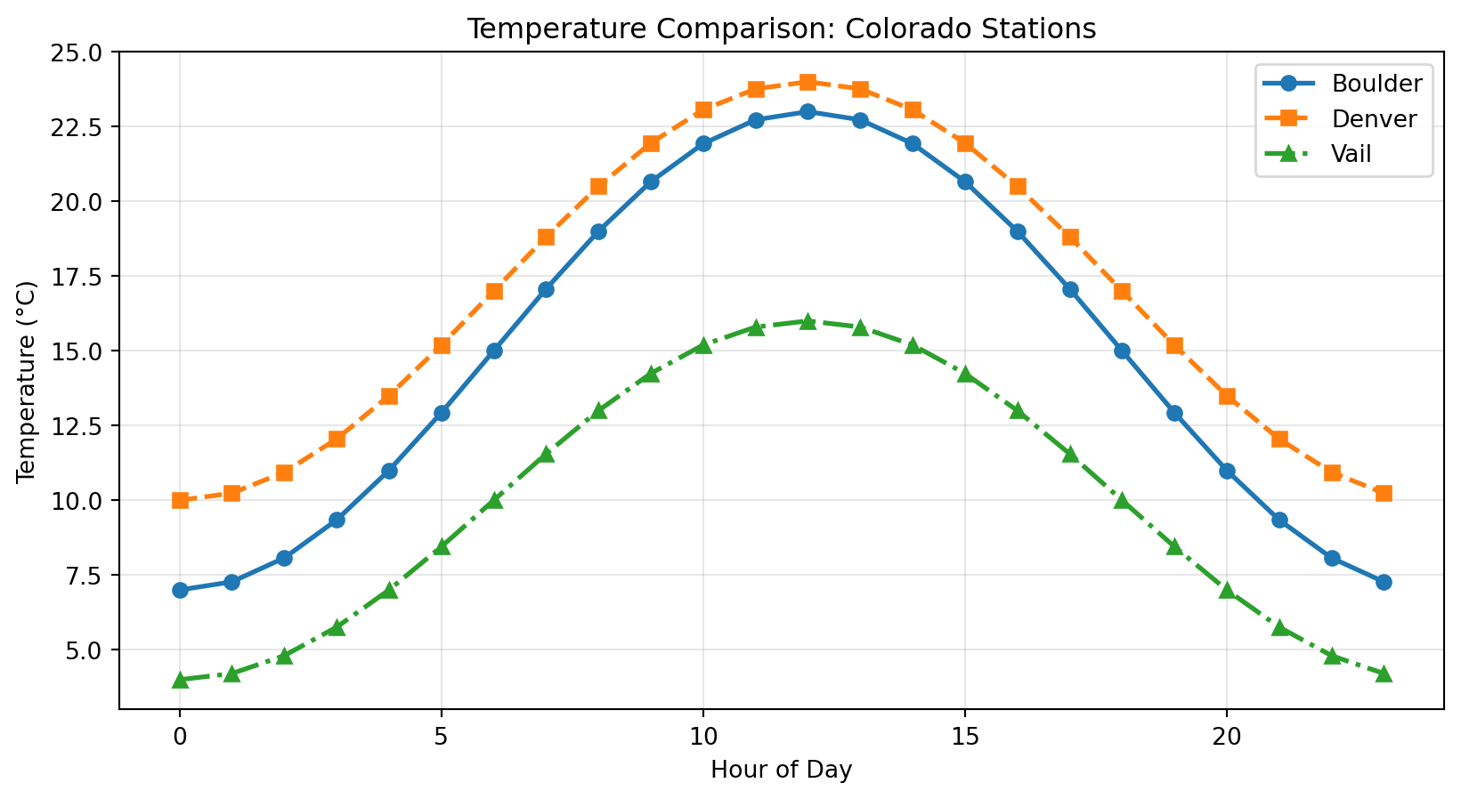
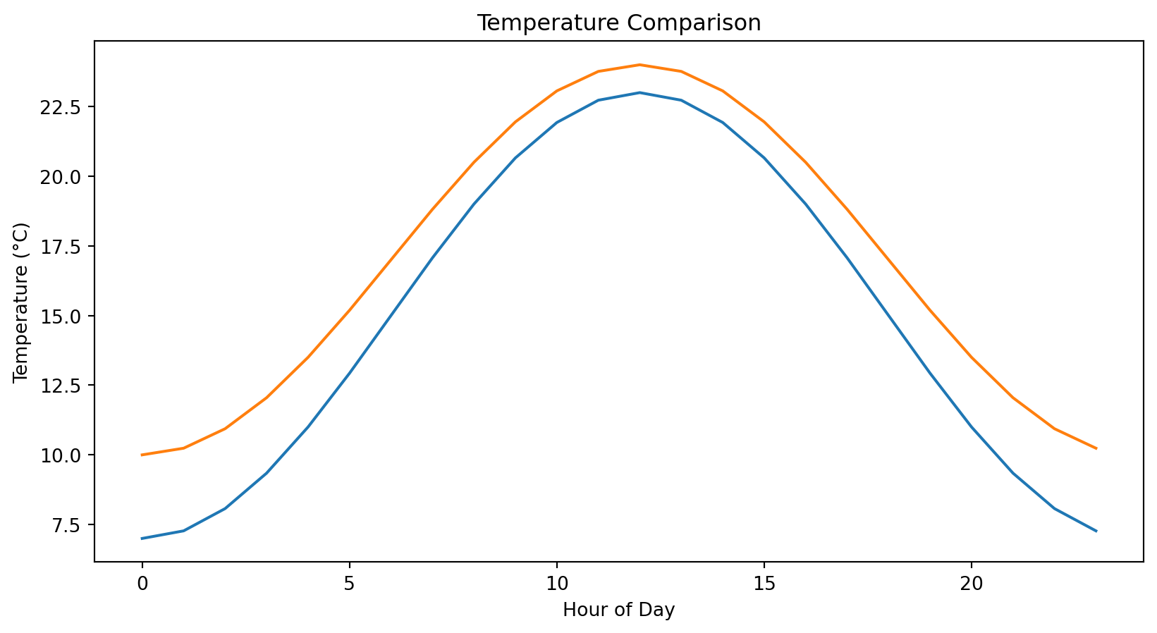
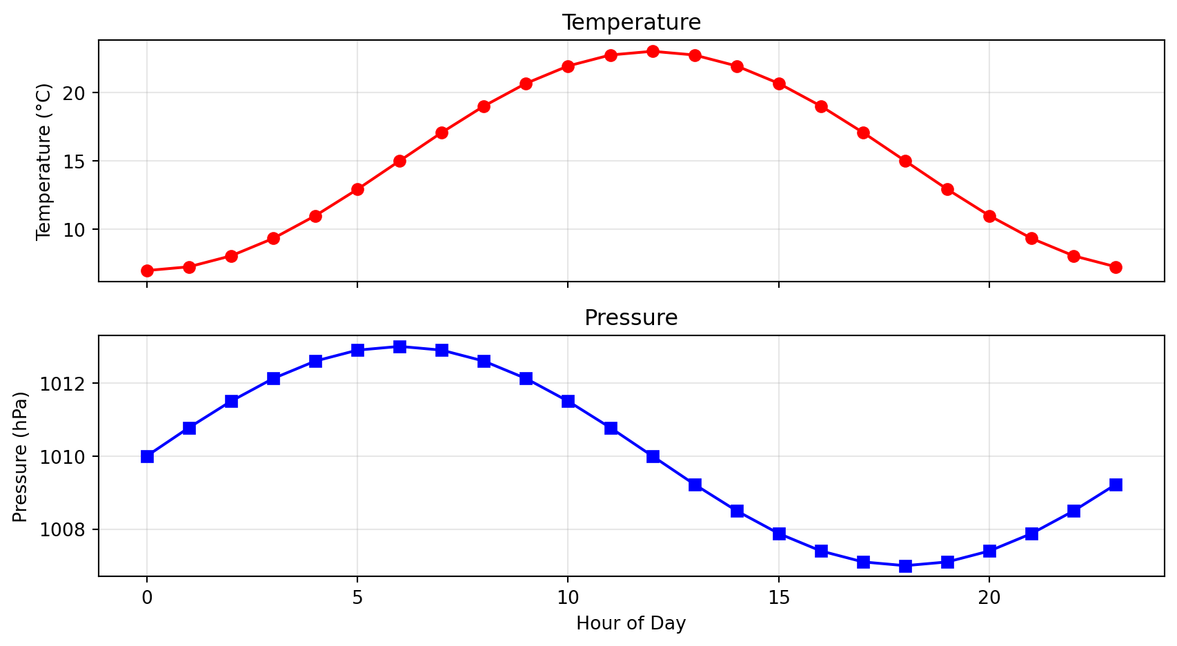
Challenge: Create a 2×2 subplot showing:
Top-left: Line plot of temperature over 24 hours
Top-right: Scatter of temp vs pressure
Bottom-left: Bar plot of mean temps for 3 stations
Bottom-right: Histogram of all temperature values
Hint:
= plt.subplots(2 , 2 , figsize= (10 , 8 ))